exhibits

Q&A with Paul Collins - June 2015

Where did the imagery in this exhibit come from? Whose cars are these? What made you want to paint them? The trees? The interiors?

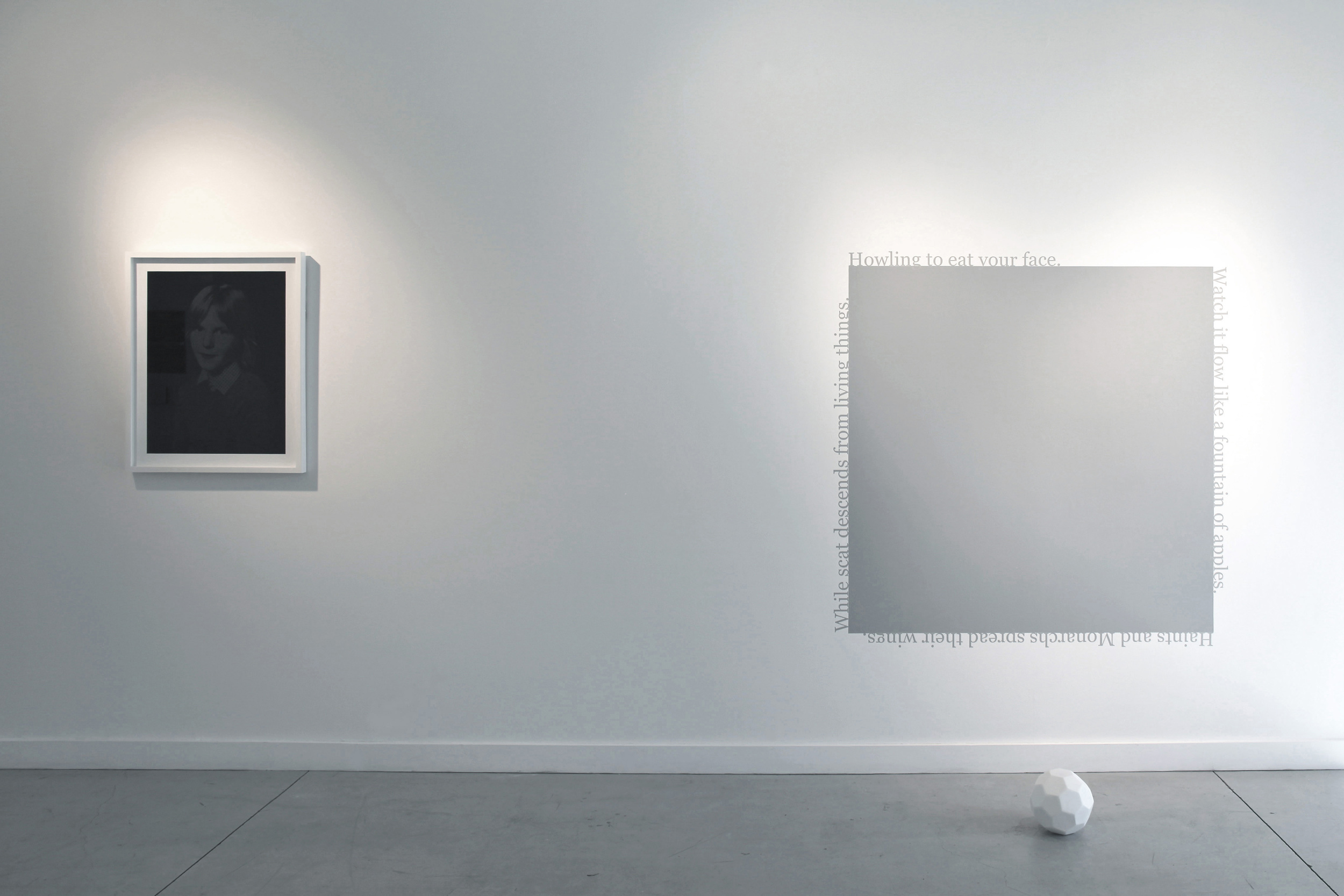
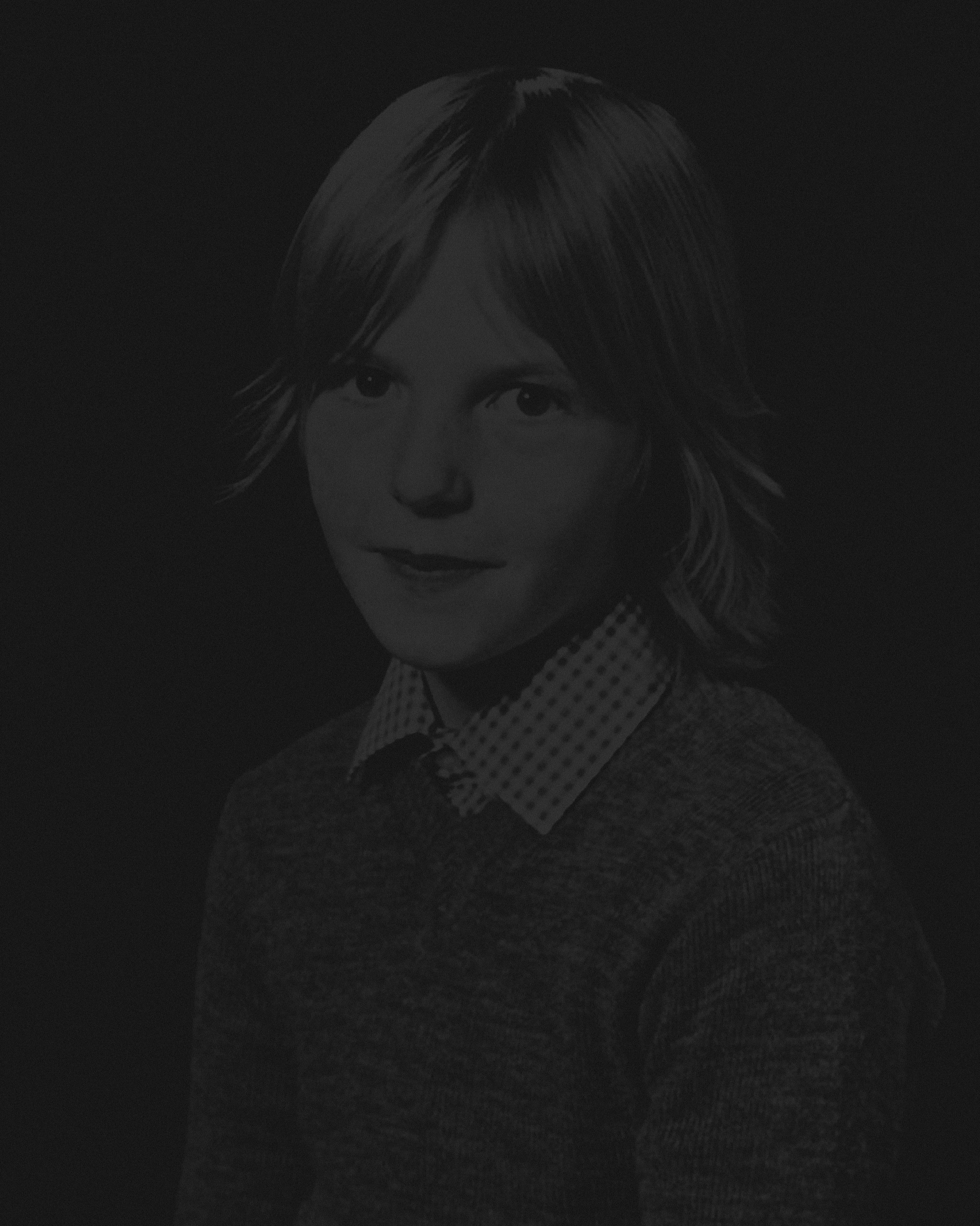
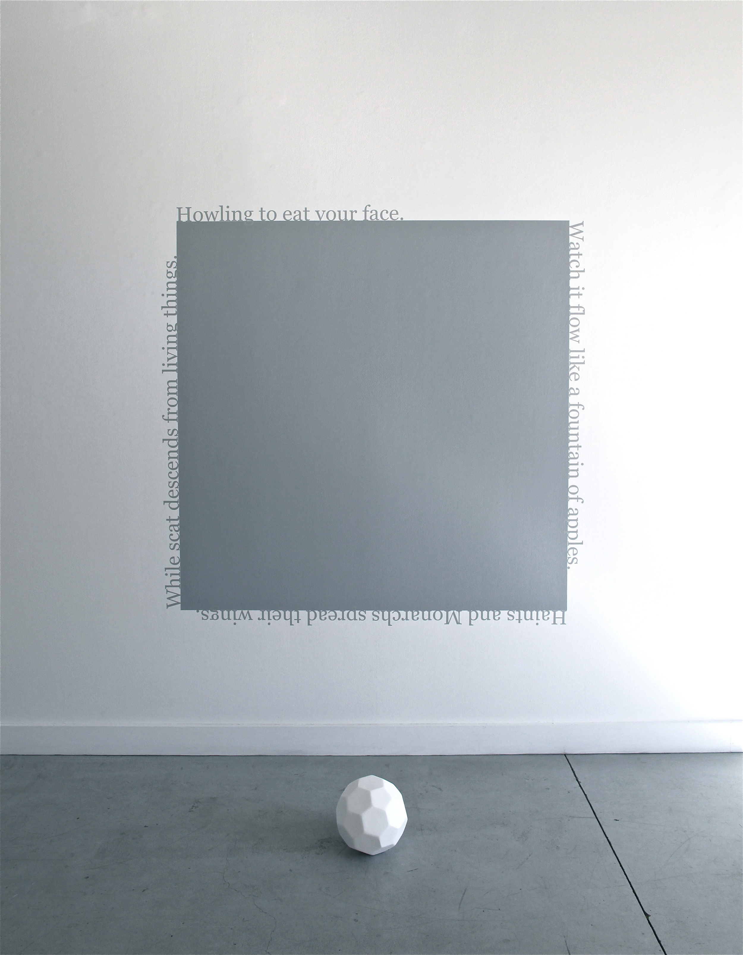
The imagery comes from daily life. That’s the way things usually work for me. My viewable daily life through a filter blend of mood, concern, fantasy, space-out and cultivated bias. The images organize themselves into narratives that reflect how I perceive their identities. I am most strongly drawn to images whose identities are not settled and flip-flop between positive and negative, or knowable and unknowable. I am strongly drawn to obvious things whose omnipresence belie the texture of their identity. That apparent obviousness and ubiquity is something shared by the cars, trees, windows, stone animals etc. The MOST ubiquitous element in these works is the scouring yellow light. I have become obsessed with yellow as both the strongest and the most conflicted color in the world.

In your last show at Zeitgeist, the work was on a much larger scale. How did it differ working in this smaller scale?

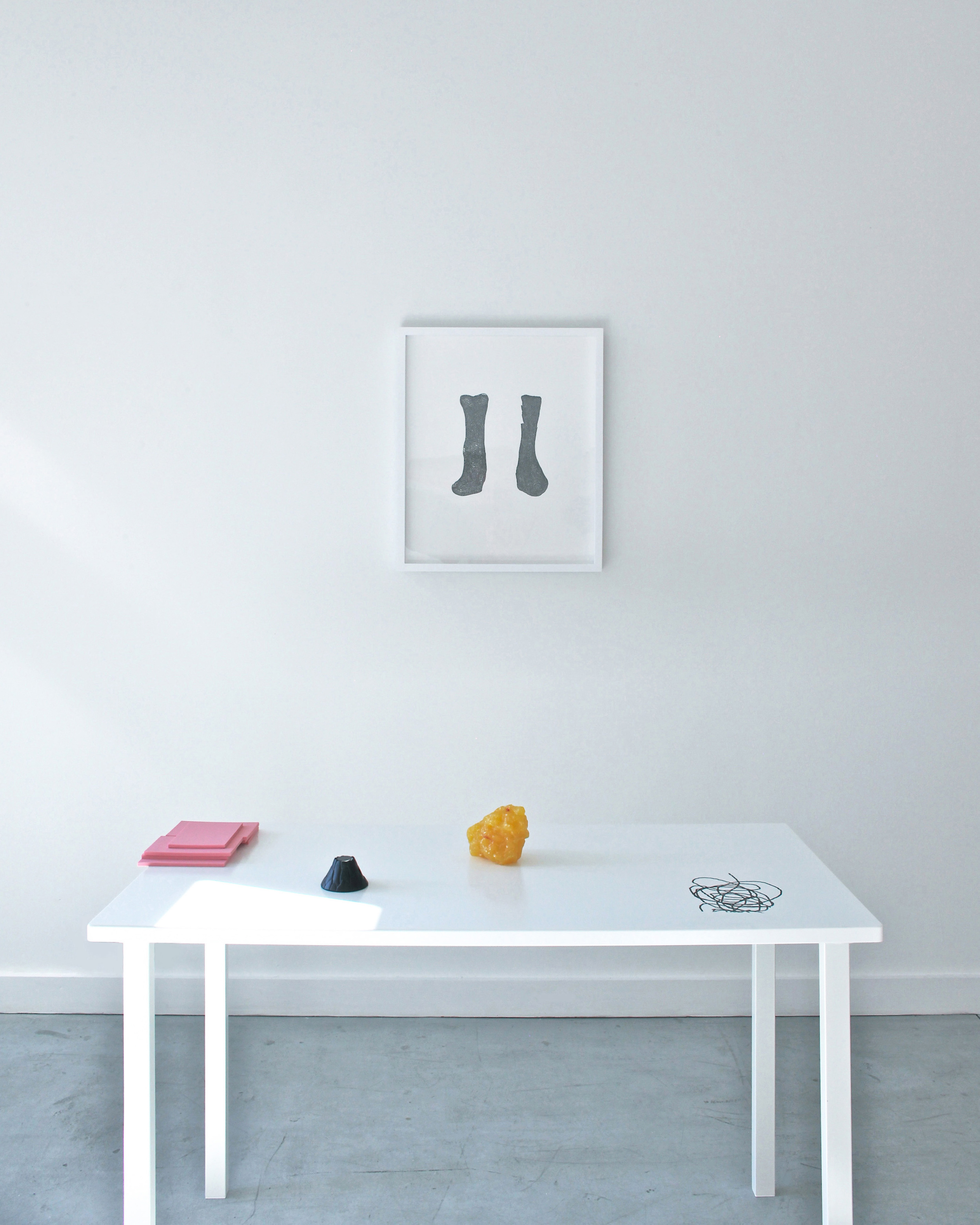
It’s been interesting and fun. More than the scale the switch in medium from ink and sculptural materials to canvas, oil paint and photographs has been exciting and challenging. I think I have been able to increase the complexity and intensity of the color experience and that was the goal. The process requires more patience but working small I can have SO many more pieces going, there gets to be a chorus of discussion between them and that is providing me with a lot of options. They are continuing to grow in scale in my studio, and I hope to have a ton of them for my show this march.

Your last show dealt with themes of fatherhood and loss of control, are you dealing with any larger themes/feelings with this work?

I think the themes in the work are consistent but wider than the personal experiences that served as a foil for my last show. In both I am interested in the foolishness of man, of ME as a man, of dreams of permanence and conquest and building a forever future. In these works I’m speaking with the egotism and arrogance of a tree hugger and real estate developer rolled up into the same dude. We usually think of the naturalist or the gardener as a sympathetic cultivator of nature, but do you think nature gives a hoot, ha! I am talking about myself here. I really do believe that there are beautiful trees and therefore ugly trees and that's a pile of horsepucky. On one cushy abstract level I’m playing aesthetic games with these symbols to poke fun at uncontested recipes of beauty in my own mind, but at the same time I can look out my window and see this city remade in front of us based on the same phony calculations and romanticisms.

Were some of these done at an artist retreat? How was that?

All the cars were made at Gallery Protocol in Gainesville during a 2 week residency. It was awesome. I made 50 drawings in 10 days- a real binge. I drew one 2 years ago from photograph I took driving of a tailgating truck. That truck was going so fast and was so close plowing up route 24 towards Clarksville where I work. My reaction was to take a phone snap (brilliant, right?) But I actually drew it because I thought my then 4 year old son would love it as he does all cars. So there it is again: a simple image that looks one way to one person and another to another. I am an early riser and walk for an hour usually before the sun comes up. I have thought of those cars as middle-aged exercise nightmares. They are not my cars. I just come across them and if I see the face first I try to get real low and close so you’re going to get bumped into.

How do the elements of collage effect the work?

Making things fun. I take photos every day and collage has allowed me to plug that stream of images and image capture into my studio work.

What books and music are you digging right now?

“Going Clear” on scientology, “Chromophobia” by David Batchelor and “6 years” by Lucy Lippard is making my head spin,

My colleague Billy Renkl lent me Sufjan Steven’s Carey and Lowell and I have been listening to it on loop for 6 weeks now. Haunting, transcendental and grounded. I think it’s changing my brain.

Paul Collins' exhibit Studio Profile is on view in the Zeitgeist project space through June 27, 2015

Jessica Wohl exhibit featured in The Tennessean

Jessica Wohl's collages of found fabrics are eerily personal

Sewanee professor and multimedia artist Jessica Wohl has spent most of her career creating artwork about the underbelly of domestic life. From collages to embroidered photographs to sculpture, Wohl is known for exposing dark sides of family units, housekeeping and the so-called American Dream. "Letting Go," her new exhibit at Zeitgeist Gallery in Wedgewood-Houston, is the final installment of a years-long exploration of the discrepancies between how we present ourselves and how we actually are.

The exhibition is comprised of eight large-scale wall sculptures that blur the line between two- and three-dimensional art. Using found fabrics and quilting techniques, Wohl's abstract compositions allude to the home as a living being, both sinister and inviting. Each work feels like eerily personal, like it's been resurrected and re-configured from the memory of someone else's past.

Wohl incorporates intimate materials and items that, for her, carry the energy of the people who used them: bed sheets, pants, underwear, stained napkins. "These garments feel alive and lived-in to me," said Wohl. "I want that history to be visible."

A distinctly human element sets this work apart from simple fabric collage: hair. Wohl incorporates hair — growing and graying, real and synthetic — to imbue the sewn fabrics with a sense of the corporeal.

"On a purely formal level, it's another texture," she said. "But it's also a material that we tend to associate so clearly with people. It gives the sense of someone living in the materials."

Closing a chapter

"Letting Go" represents the twilight of a conceptual obsession with the illusion of picture-perfect domestic life. "I've said everything I can on this topic," Wohl remarked.

The abstract forms are intended to look limp and weary to reflect the idea's final stages. The heavy-hanging objects seem to exist largely as evidence of the life they once had in them.

"Blue Bunches," the first piece completed in the series, is an embroidered collage made of napkins, pillowcases, underwear, faux fur and hair. "There were parts of it that looked like phalluses, parts that looked like breasts — it was surprisingly bodily," said Wohl. "The notion of hanging, drooping and sagging started to make sense conceptually after I realized I was repeating it a lot. The lifelessness, the loss of elasticity, the notion that things are wearing out."

For much of her childhood and adult years, Wohl remained suspect of blissful family life. Growing up in a dysfunctional family, she worried she would never be able to have one of her own. "I thought I wouldn't be able to trust that mirage," she said. But now, happily engaged, she says found resolution in her own personal life and wants to move forward in her artwork as well.

"It's a celebratory parting," said Wohl. "The work I anticipate coming after this — which I don't yet have visuals for in my head — still deals with my family and issues that revolve around it and the home, but in a very different way. My work will eventually move more toward notions of race, because that's what my family will be dealing with."

Also at Zeitgeist, don't miss contemporary dance company New Dialect's last two performances of "Planes," a groundbreaking 1968 installation by Trisha Brown, at 11 a.m. and 6 p.m. Saturday in the gallery's back room.

Brown's "Planes" installation is a film of aerial footage, shot by Jud Yalkut, projected on an 18-foot long, 13-foot high wall that has concealed holes at equal intervals across its entire surface. Three performers traverse the surface in slow motion, giving the illusion of falling through space. The 20-minute-long installation aims to reorient viewers' perception of gravity as the performers move across the wall.

"It's an honor for us to have the opportunity to participate in the tremendous legacy of Trisha Brown," said New Dialect director and founder Banning Bouldin. "She's had a enormous impact on how contemporary dances are made today — rule games, chance operations, spatial architecture, structured improvisation, and inter disciplinary collaborative are the bedrock of what we call 21st century dance."

The multiple performances of "Planes" at Zeitgeist, a total of nine throughout the month of May, are organized in conjunction with OZ Arts Nashville and the Trisha Brown Dance Company's "Retrospective in Three Parts" that premiered at OZ earlier in May.

"Brown's work is timeless," said Bouldin. "The collaborations and methods she began exploring in the '60s were groundbreaking then, and are still thought provoking and inspiring today. Each time I speak with viewers after we perform, I find a few who had no idea the work was created 47 years ago."

Sara Estes, for The Tennessean

Q&A with Jessica Wohl

Log Cabin Drip Drape

Log Cabin Drip Drape

In your artist statement, you say this is possibly some of the most formal work you have made. Would you consider the formal nature of the work to be in tension with the inherently useful character of fabric and quilting? If so, could you briefly discuss how that tension may speak to the nature of the work?

I actually see the character of the fabric and the quilting as being a significant part of those formal choices. Being that I'm at the end of a body of work that has been exploring the same concepts for the last eight years, by feeling a resolution with those issues, I'm able to let these works be predominately defined by their form: their colors, textures, lines, patterns, etc. Where I see the most tension in the work is between the fabric and the hair. While the fabric may conjure up notions of nostalgia and familiarity, the hair disrupts a sense of comfort often associated with quilts and domestic textiles. 

Blue Bunches

Blue Bunches

Where do you mine the majority of your materials? Are they used and reclaimed from thrift stores or yard sales, carefully selected from fabric stores, or from personal collections?

All of the above. Mostly, the fabrics come from thrift stores or my own home. My old clothes, as well as my finance's clothes, rarely make it to the thrift store anymore; now they either end up on a shelf in my studio or on a gallery wall. 

How do you use the language of varying fabrics (velvet, cotton, lace, knits, rayon, etc.) to create dialogue within the pieces?

I rely on the associations people may have with these fabrics to inform the work. For example, some lace might imply lingerie while others might imply a tablecloth. Polyesters will tend to imply something dated, while a solid cotton shape might feel more timeless. Some fabrics might evoke delicate dresses while others can clearly be recognized as masculine, button-down shirts. Hopefully these contradictions will confuse a viewer, and encourage them to spend time figuring out, or considering, these tensions. 

How do you see your work responding to a history of feminist textile works, such as that of Faith Wilding? 

Red Drippy Droops    

In making this work, I didn't intend to respond to the feminist textile artists who came before me; in fact, I have a hard time calling myself a textile artist, even if that's what I am. I approached these works as a painter who likes to sew, using fabric as my paint. That said, I do rely heavily on associations with domesticity and femininity through the use of textiles and their history. 

The recurring forms in these pieces imply specific verbs: droop, fall, sag, slouch, dip. How does this language inform your concepts?

The concepts I had been exploring for years came to the end of their life in this body of work. I'm tired. The work was tired. In a way, these old ideas are dying. I used the droop, fall, hang and slouch as way of expressing that spent energy. It imbues the work with relaxation, despite its otherwise highly active aesthetic. I want it to feel like it's lost its elasticity, but that there's still something valuable in it's old, nearly-lifeless body. 

Jessica Wohl's latest body of work, Letting Go is on view at Zeitgeist through June 27

Q&A with John Donovan

Beast Head Wear

Your use of ceramics breaks expectations that traditionally label clay as a medium of “craft” and not “fine art”. What tactics do you use to break down these assumptions?

I feel like a lot of time and energy has been sucked into the black hole that is this “craft” and “art” hoo-hah with ceramics. I know where I stand for myself, and I know what I talk about in the classroom. For me, the technique (craft) should always be in the service of a greater idea or concept, the content of the work. If the work digresses into merely technical exercises that initiate no greater dialog going beyond the physical object, then something is missing.

There are a lot of technical masters out there, who invest lots of research capital on getting glazes to do just this or that, then they sit around with a little club of like-minded individuals congratulating each other for achieving this or that glaze affect, all the while neglecting to think about what they are putting that glaze on, or why they are making the object in the first place, the “why” of their work. Technique (how) serves concept (why), that’s my rule in the studio. When I have an idea I am trying to express, that idea is where I look for clues to help me make purposeful decisions about what techniques will best manifest that idea.

Technique always follows, never leads (for the most part.) What do you want to say? Wrestle with that first, then decide how you might best say it.  I also feel like our regional geography is a bit of an impediment to the medium of clay, there are other regions in this Great Nation of ours where this dialog has been put to bed decades ago, West Coast, Northeast, even in places like New Mexico and up in Seattle and the greater Northwestern area, this craft-art stuff has diminished due to the variety of high-quality work being made. Go to the Philadelphia Clay Studio, and you won’t see philosophical rants about craft and art, you’ll just see world-class work.

Chartreuse Bear Warrior

I am a big fan of high-quality functional work, I have learned a lot from world-class potters like James Watkins, Peter Beasecker, who make pottery simply to DIE for. I tell my students to make the best work they possibly can at that instant they are working, and if they can do that, no one will care if it is art or craft, they will care because it is good. Make good work, that’s what is needed right now. I am also a big fan of the intimacy of the pot, how we crave to reach out and touch it, hold it, bring it to our lips. That’s a big part of the allure of the medium for me, we want to explore it not just with our eyes, but our sense of touch as well. Few things make me as happy as watching viewers reach out to touch the work and encounter that odd internal speed-bump of not being allowed to because it’s art, but also having their primitive brain remember that it’s made of clay, and we touch clay, we have been handling it for as long as we have developed civilization. Just go work, work hard, and make sure the work is the best it can be at that particular time.

What contemporary ceramicists and artists influence your work?

I am embarrassed to say as an educator, but I don’t do my homework like I used to, and the most current work is often not on my radar. As a student, I can remember being enamored with the abstraction of Constantin Brancusi, that concept of diluting a subject matter down to its conceptual essence, not even based on the corporeal form any more.

The work ethic of Richard Serra stokes the inner fire and compels me to just go work, even when feeling tired, sick, or not necessarily “moved by the muse”. Any recorded dialog of his is gas in the tank. His buddy Philip Glass moves me to work, too. If I have a big run of pottery to make, that’s the golden ticket. Martin Puryear makes forms that, when I have been lucky enough to see first hand, fuse me to the spot.

I love how work seen in books, magazines or photographs that appear so clean, refined when met in person carry with them a patina and residue of the process, a record of their making, much like a Jackson Polluck is a record of the choreography between canvas and the body of the painter.

The Scottish artist David Mach shows up in my 3-D Design lectures regularly, I like his wit and inventiveness. How he can turn a recognizable subject on its ear and make it new to us. I think that can be some of the best work, something familiar that you meet again in a new way. Yoshitomo Nara is a Japanese artist who I met thanks to a children’s book given to us by family friends many years ago, his sculptural forms are exciting. 

I find it simultaneously inspiring and disheartening when I find work by someone exploring similar themes but doing a much better job of it, Kukuli Velarde is an artist like that working in clay. She weds history and contemporary more beautifully than I could ever hope to. The emotional-narrative-animal based ceramic magic (for lack of a more appropriate word) of Beth Cavener is beyond impressive.

Joe Bova, my undergrad professor’s grad professor at LSU, is someone whose work I regularly look up, my academic “grandfather” in a way. Politial narrative-figurative forms, and masterfully executed. I watched him give many a demo at Loyola as a student, and can remember those events being important moments. I think an implied narrative is something I enjoy. There’s a lot, but I need to be looking more than I do. Sometimes, it gets hard to find the time to keep up.

Many of your pieces feature recurring symbols, such as the luchador mask, and the bunny and cat-eared headpieces. How are these motifs chosen, and how do they function?

Tiny Spotted Tiger Luchador

The luchadors were chosen as contemporary renditions of Pre-Colombian warriors, Jaguar Warriors, which are among my truly favorite historic subjects. In “Mexico Before Cortez”, Ignacio Bernal describes Jaguar Warriors defending Mexico City from the surrounding jungle, these mythic super-warriors who, after killing a jaguar, would assume its traits and powers. They would seize approaching Spanish infantrymen from out of the jungle, leaving soliders behind wondering what the hell that was, that half man-giant cat that just grabbed their buddy and dragged him away screaming. In grad school, I read this book many, many times, which is funny, because my work had not yet moved in this direction. For me, the Luchador is a modern reference to these superheroes from Pre-Colonbian cultures.

Two Black Eyes & a Bloody Nose

Many of the animal forms were based on cartoon characters pulled from my childhood and thankfully returned to my world through my children when they were younger. I can remember my daughter, now 10, asking me about 3 or 4 years ago what I was going to make art about once she grew up. At the time, I was making large-scale “mash-ups” of Kathy the Bunny, loyal sidekick to Hello Kitty, and Q’in Dynasty Chinese Terra Cotta warriors. The animal forms are intended as light-hearted icons, evocative of a simple, pleasure-seeking childhood frame of mind. They function to disarm the viewer a bit, make them comfortable with the work, and hopefully to then create a stark contrast to other ideas present in the work, ideas associated with conflict, combat, warfare, fighting, death. The cute is the counter to the bitter, which I openly admit can be a heavy-handed formula. Is this getting a bit formula?

What aspects of pop culture inform your work?

Tiny BunnyCap

I grew up on comic books, so it would be silly not to admit that is where most of my image-making began. My older brother was much better at drawing, I can remember watching him spend hours drawing large blow-ups of individual panels from Sgt. Rock and X-Men comics, later I would get my ass kicked for sneaking in to his room and dropping in some colors. Exaggerated heroes and villains from comic books, villains always seemed more inventive. I also watched a lot of cartoons; Masters of the Universe, Transformers and G.I. Joe were my after school ritual for a long while. Possibly too long.

I can’t express the joy and excitement that my first trip back into a comic shop with my son brought. He’s 15 now, at the time 4 or 5. After one of the most thoughtful walk-throughs I’ve ever been a part of (lots of “What’s his name? And what can he do?”), he settled on Batman. Oh, the chance to go back through it all again, to revisit familiar stories, to explore those I chose not to when it was my first time, it was great. The door back into this world was unlocked and flung wide with the key called parenting. I certainly have gotten more out of it than I deserve. Now with the movies, my goodness. And there is so much new stuff that is so smart, so well done. The first time I watched an episode of “Adventure Time” with both of my kids about 2 years ago, I think they were scared for me.

What aspects of history inform your work?

Tigre Rojo Luchador

Some of the warrior figures I make are heavily influenced by the style of Moche work, Azec, Mixtec, there is acuity and brevity of image making there that is remarkable. Pre-Colombian clay work is in my work, there is something magical about the balance of detail and abstraction that I enjoy and seek. Japanese Haniwa figures and horses equally inspire me.  Colossal Olmec Heads are great.

Regarding clay, well before we developed the technology for fired ceramic that led to functional work, we were proto-cultural image-makers in the caves of Altamira, Lasceaux and Tuc d'Audobert in the French Pyrenees, sculpting clay bison by firelight. This is the beginning of the story that every ceramic artist is contributing to today. That’s amazing to me, knowing that I am part of that continuous narrative, a human making forms out of clay for my fellow humans to contemplate and enjoy. What is possibly better or a more species-defining practice? Got me. Then we mastered how to fire it, how to make pots, forms that are impervious to rain, to the elements. Bricks. Where would we be without bricks? Fired clay was an evolutionary step for us as a species, it is what the heat-reflective tiles on the nose of the space shuttle are made out of, and what we drink coffee out of.  It’s an exciting material that brings with it a rich history that is imbedded in us on a molecular level.

How do you see these references to contemporary pop culture functioning within the work? Are they critical, analytical, investigative, etc.?

Colima Kitty Head (in foreground)

I’m not entirely sure how these references function. I don’t think it’s critical, I don’t like preachy work, I think it’s more about reminding the viewer that we are not so far from where we began, but not in a bad way. I like the idea that ancient “pop” culture (such as Jaguar Warriors) can easily be compared to contemporary luchadors or superheroes. In that way, I guess it’s analytical, reminding us of who we are, comparing the old and new, creating a time-based hybrid. We are myth builders, storytellers, ranters all. I guess for me it’s investigative, I like seeing how I can concoct a new combination of images or sources to make something new, something I have not seen in the studio before. That’s investigation for me, that moment where the parts are coming together, and I’m not quite sure when it will be done, when it will be complete, that’s the fun.  I have colleagues who talk about the struggle, but I find it extremely fun, The struggle is usually finding the time, but once that is done, it’s just fun. Even the failures are fun, because you build on them.

John Donovan's latest exhibit New Personal Best! is on view at Zeitgeist through June 27, 2015

Interview with artist Lain York

Where does the name Scissor Bell come from?

Lain York in front of Landscape: Thompson Lane and Armory Drive (Crazy Cave)

It came from a conversation about My Little Pony (Sweetie Belle). I liked the idea of a title that alluded to a simple deconstructive process and something suggesting resonance.

How does working in vinyl change the way you express ideas? Does it limit you?

The new work is very abstracted but I still think of it as figurative. I wanted to address the figure in a new way (for me); to move away from silhouette and into a more organic way of drawing. I thought of Alberto Giacometti drawings and the way he moved from the inside out rendering a figure. The web-like imagery was looking at the figure, drawing grids, and connecting dots within the grids. I then used the finished shapes as templates to make several, layered resonating shapes. Weaving strips of color was another fun, very rhythmic process.

Portrait: BobLobertiniJackieFargo

The vinyl is fun and immediate but it is also very particular; there are rules. There are moments to break the rules and some negotiating that goes on. Whether I work with paint, graphite, correct tape or vinyl there is a particular sensitivity that I think has to be respected that’s important for successful finished pieces.  I think that through attentively addressing parameters or limitations, one sees more possibilities. 

What inspired you to make this show about Nashville? What are you trying to say about the city? How does it fit in with other recent shows about Nashville – Brady Haston’s?

The end of the year is always a very inward looking period for me. The city is progressing so quickly and as a native, I of course feel that some things are being lost. I also feel that Creative Industry in Nashville has much to do with this development. Almost all of the references are from things that are now gone but that’s the natural trade-off for moving forward and I am comfortable with it. I like the analogy of being an archaeologist and assessing a progressing landscape from looking down at what has been covered up.

Barging Session (Fairfax and 32nd Avenue), 2014

I thought Brady Haston’s document of Chronicles of the Cumberland by Paul Clemments was a brilliant example of using abstract painting to convey a very particular narrative. I don’t think mine sought to be nearly as articulate or focused. The idea of Narrative, particularly more localized accounts is incredibly timely; I see it everywhere. Story-telling in the digital age seems to be human beings beginning to scratch the surface of making sense of ridiculous amounts of data we gathered. Inevitably, this narrative has deep roots in the past.

How has your work changed since your last show? Is this more personal?

I definitely wanted to move away from anything as content driven as earlier work. Emphasizing the more formal aspects of the new series (color, texture, rhythm, etc.) was very important. The process of making the images has to be engaging and I pulled images/shapes from a lot of fairly unrelated sources. The previous body of work was very focused and it was a bit of chore this go-round to focus. There are many new avenues that I am looking forward to exploring because of this.

Stuart Davis - Report from Rockport, 1940

This latest work was indeed very personal. I am still absorbing it.

Who are your current influences?

Stuart Davis, Matisse, N Dash, 70’s skate board magazines/Glen Friedman photography, Gedi Sibony, George Condo, Jean Michel Alberola, Hurtado Segovia

Scissor Bell is on view at Zeitgeist Gallery through February 28, 2015

Interview with artist Jeremiah Ariaz

How and when did the project that became Once Upon a Time in the West start?

The project started in 2007 after a chance stop in Tucumcari, NM. I became enthralled with the town and for the next four years returned whenever I had the opportunity, usually twice a year for a few days at a time. As the project took shape I became aware of the Sergio Leone films that were made in the Almeria region of Spain, a landscape that looks like the American West. One film in particular, For A Few Dollars More, was partially set in a fictionalized Tucumcari. This provided a perfect link for me to photograph there as a companion project.  

Installation, Once Upon a Time in the West by Jeremiah Ariaz

My work often deals with the tension between reality and artifice. Therefore, the kind of conflict I try to highlight in a photograph, I could think about in a broader context over multiple projects. This opened up creative possibilities for me. 

What is your personal connection to this project?

As a boy growing up in Kansas, I felt a particular draw to the West.  Where “the West” begins has been a shifting, even contested, local. Once, to be west of the Mississippi River was to be in the West. Today, I think most people imagine a Southwestern landscape and the Pacific coast. I guess for me, the West began in Kansas. There is a romance to the West, which admittedly, I never felt, but seemed to intrigue people I met traveling, especially abroad, when they learned I was from Kansas. Maybe the work started trying to understand what they thought of as the West.

Indian on Horse, Western City (Dasing, Germany) 2013 by Jeremiah Ariaz

Where did your travels take you and what surprised you about what you saw there?

In addition to photographing in New Mexico, this project took me to southern Spain and across Germany. It was startling to see people from other cultures reenact stories I’d thought of as distinctly American. 

How has it changed how you think of American history? Of how outsiders view it?

I tend to read American history with a critical eye. Much of my artwork questions assumptions people historically had, such as the idea of Manifest Destiny.  I think by often showcasing facades in my work, one might question the American ideas at their root…. ‘if what I’m looking at isn’t real, what is?’

Who are your artistic influences?

August Sander

There are many. I’m drawn to August Sander and his ambitious attempt to create a collective portrait of German society in the twentieth century. I was thinking about him as I was trying to portray Tucumcari, and how that one place might be a window into America. I appreciate the stark realism of photographers like Dorothea Lange, most known for her images of depression era America, and writers like John Steinbeck. The characters in Steinbeck’s novel, “The Grapes of Wrath” seemed to populate the New Mexico town where my project started. I’m drawn to the colors and the melancholic sense of isolation in Edward Hopper’s paintings. Richard Prince has long been an influence for me, particularly his “re-photography” of the Marlboro Man and the questions his work raise of authorship and masculinity. When I started working on this project I had a chance to see several Sergio Leone’s films on the big screen, which was a real thrill. I would be amiss not to mention Andrea Robbins and Max Becher, a husband and wife team that also photographed German Indians (specifically the reenactors rather than the theatrical performances most of my images highlight). Alec Soth’s work always excites me; most recently the “Dispatches” he has been doing though his publishing company LBM. As a teacher, I’m influenced by my students that get excited when discovering things for the first time and those that show sincere commitment to their work.

Ariaz's show "Once Upon a Time in the West" is on view at Zeitgeist Gallery through February 28. View available works.

New Work by Christopher Roberson

"My practice, while rooted in sculpture, finds its genesis in line, or more specifically, the disruption of line. I am interested in line that has been warped, distorted, liquefied, rotated, and abruptly ended. The source drawings for my sculptures are often produced digitally, which makes it possible to see an origin line manipulated in real time. This vulnerability that is applied to the drawings often produces unanticipated results and allows the injection of chance into a process that can be very methodical. Working in a vector environment also gives me the freedom to play with an economy of imagery that can be repeated and scaled infinitely.

In Full Sight/ I Think I’m Gonna Be Sick

The work shown in Cannonball Run 3 at Zeitgeist finds me picking up the scraps of these source drawings and allowing them to stand alone. Mining a lexicon of cartoons, sports, and the suburban landscape, the resulting structures, while abstract in nature, can become familiar and elemental. I feel that this recognition magnifies the irregularities and modifications of material. The subtle contrast between textures like black adhesive vinyl and black vinyl fabric, reinforce these ideas. My intention is to call up associations with youth and exterior/interior domains- aiming to in some way preserve the juvenescent spirit, while acknowledging its fading vitality. 

The series of prints called Wallop developed through a push-and-pull of creating space and then immediately jumbling the imagery. This process was repeated until I felt that the pieces snapped into place and a tense harmony existed between the gestures. Built upon a Peanuts comic, the individual elements were both reduced and camouflaged by the added imagery until the source nearly vanished. By isolating the compositions on a field of black, my hope was to create a sort of gravity and isolation in the drawings. There is a ubiquitous loneliness that I wish to acknowledge in my work."

Wallop Series

Will Berry/The Tennessean

On a hot autumn afternoon, a few hours before the opening of his first show at Zeitgeist in 11 years, Will Berry looked remarkably cool in a crisp white short-sleeved Oxford shirt tucked into neatly pressed khakis. His appearance matched the calmness of his work.

“The Night of the Iguana” is an understated, subtle collection of paintings, a quiet show with no labels (all the pieces are untitled). Manuel Zeitlin, whose architectural firm shares space with the gallery, described it as Zen-like.

Curated by Victor Zamudio-Taylor, the show remains on view through Oct. 26.

The larger paintings use three metals — aluminum, lead and graphite — and layers of patterns based on Mississippian Indian motifs, simple drawings referencing autobiographic details from Berry’s family history (“symbiotic autobiographical sketches,” he calls them) and varying hues created by oxidation of the metals.

Though conceived as individual paintings, the works are particularly effective when grouped either as a triptych or in a block of six: graphite, aluminum and white over aluminum, white and graphite.

The aluminum paintings have the patina and reflectivity of antique mirrors while the graphite paintings are full of barely perceptible hues, faint reflections and just-discernible designs.

“The metals fuse, contaminate, change each other to become something new,” Berry said.

“This is really two different shows when seen in natural light versus artificial light at night,” Zeitgeist’s Lain York said. He also said the presentation of the show pushes the limits of minimalism, which is something he and Janice Zeitlin wanted to explore in this new space.

Zeitgeist is at 516 Hagan St., Suite 100, and is open 11 a.m.-5 p.m. Tuesday through Saturday. There is no admission fee. For information, call 615-256-4805.

— MiChelle Jones,

for The Tennessean